Key takeaways
- Black remains an established design choice, with dark grey offering softer contrast.
- Iron Ore names and finishes vary between suppliers; compare physical samples.
- Interior and exterior colours can differ where the chosen window system allows.
- Coordinate frames with permanent exterior materials and interior finishes.
Trending Window Colours in Canada for 2026: Black, Iron Ore & Beyond
Window colour can change the character of a home before you change anything else. A dark frame can sharpen a light exterior, bring definition to brick, or turn a kitchen window into an architectural feature.
For Canadian homeowners planning a replacement in 2026, black, charcoal, and Iron Ore deserve a place on the shortlist. But the best choice still starts with your home’s materials, light, and interior finishes—not a trend alone.
What is actually trending in 2026?
Canadian industry guidance points to continued interest in dark frames, alongside warmer, nature-inspired palettes and more flexibility between interior and exterior colours.
Matte black remains an established design choice, while charcoal and deep grey offer a softer version of the same contrast. Warm taupes, earthy tones, and different colours on the interior and exterior are also part of the 2026 design direction.
1. Black: a confident frame for the view
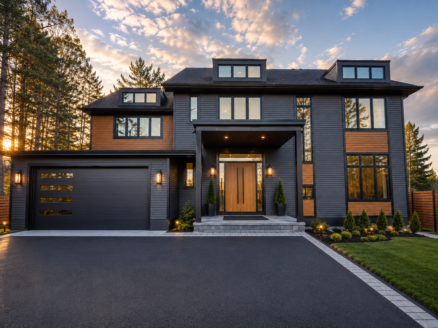
Black remains one of the clearest ways to give windows a deliberate architectural presence. Against white siding, pale stone, or light brick, it creates a crisp outline. Beside natural wood, its contrast can feel warm and grounded.
Inside, black can connect a window to dark lighting, cabinet hardware, or other accents. It does not require an entirely black-and-white room.
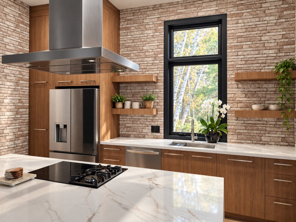
Black inside and out: the interior frame pairs with warm wood cabinetry, light brick, and pale countertops.
Why this kitchen palette works
The frame gives the tall window a clear outline, while the wood cabinetry keeps the room inviting. Pale counters and textured brick provide balance. The result is a useful example of how black windows can belong in a warm interior rather than only a minimalist white space.
Consider black when: you want strong definition, have exterior materials that suit contrast, and like the idea of the window becoming part of the room’s design.
2. Iron Ore and charcoal: dark contrast with a softer edge
If black feels too sharp, look at Iron Ore, charcoal, or other deep greys. These shades can retain the visual weight of a dark frame while offering a gentler transition to stone, weathered brick, or grey-toned cladding.
Iron Ore sits within the deep-grey family, offering a rich, understated alternative to pure black.
Do not order by colour name alone. An “Iron Ore” finish from one supplier may differ from another supplier’s charcoal—or from a similarly named wall paint. Compare actual samples and the exact finish code.
Consider dark grey when: your roof, stone, or trim already has grey undertones, or you want a dark frame with less contrast than black.
3. White: a classic option that still belongs
A trend guide should not leave out white. It remains a versatile choice for interiors where you want the frame to blend into light walls and trim.
White can also be the right exterior decision when the home already has a coordinated light trim scheme. Replacing only a few windows? Matching the existing palette may create a more cohesive result than introducing a new dark colour.
Consider white when: you prefer a quiet frame, want continuity with existing windows, or have light interior millwork you plan to keep.
4. Warm neutrals and bronze-inspired tones
The broader 2026 design direction includes warm taupes, earthy colours, and bronze. These can complement cream stone, brown roofing, warm brick, and natural timber.
Treat these as colours to explore through samples. A shade that looks sophisticated on a screen may look too yellow, cool, or dark against your own masonry. Availability also varies by window material and product line.
Consider a warm neutral when: your home’s fixed materials lean brown, beige, or cream and a cool grey would feel disconnected.
Black outside, black inside—or a different colour on each side?
Choosing an exterior colour does not automatically settle the interior.
- Black inside and out: creates a consistent, intentional look and makes the frame a visible interior feature.
- Dark outside with a light interior: allows exterior contrast while keeping the room-side frame more subdued.
- Light inside and out: maintains a softer, more uniform appearance.
Dual-colour options depend on the selected window system. Confirm which parts receive each finish, including the sash, main frame, grilles, trim, and hardware. The surrounding brickmould or capping should be discussed separately rather than assumed to match.
How to choose a colour you will still like later
Start with the elements you are least likely to replace: brick, stone, roofing, and major interior finishes. Then compare your window samples with them.
View samples outdoors in sun and shade, and indoors beside your trim and cabinetry. Check the finish as well as the hue: texture and sheen affect how dark a frame appears.
For dark finishes, ask about the factory coating or finish system approved for the selected frame material, care instructions, and warranty terms. Do not assume an ordinary dark paint is suitable for a vinyl window.
Finally, keep appearance and performance on the same checklist. Colour alone does not establish energy efficiency; review the selected window’s glass package, performance ratings, installation scope, and applicable ENERGY STAR® certification.
Planning new windows with Alpha Windows
Our recommendation for 2026 is simple: shortlist black for definition, Iron Ore or charcoal for softer contrast, and white or warm neutrals where they better suit the home.
Bring photos of your exterior and interior when discussing your project with Alpha Windows. Ask us to confirm the available interior/exterior combinations, physical colour samples, finish details, and pricing for your selected configuration.
Start with the Alpha Windows estimator, then confirm the colour and finish with our team before placing an order.
Colours on screens are approximate; approve a physical sample before ordering.